(SCROLL DOWN)
Kumo Ramen / Ervin Attitude
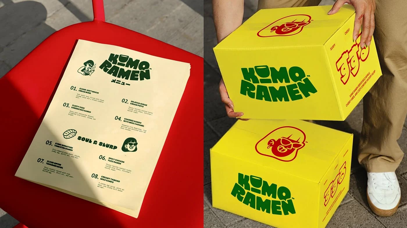
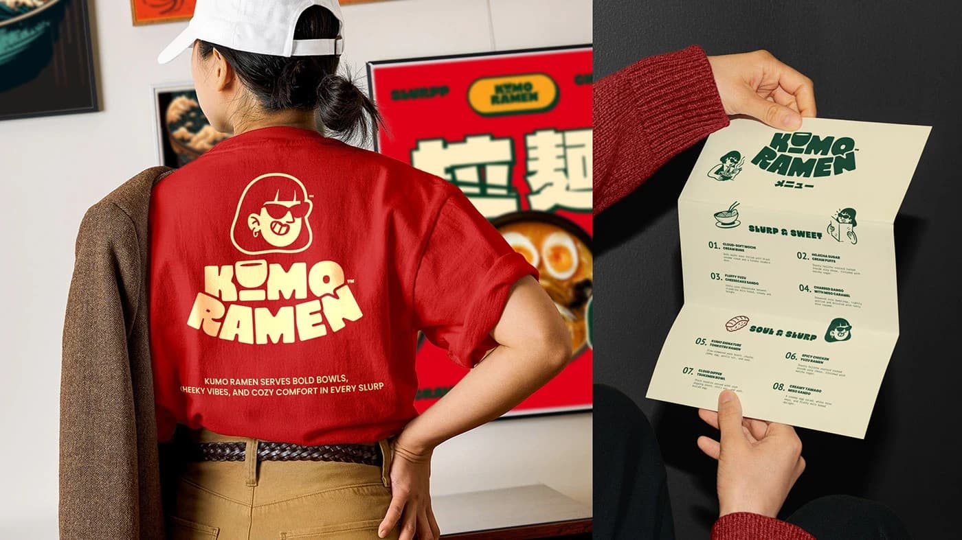
Kumo Ramen was a branding challenge focused on bringing a modern, minimalist take to a traditionally bustling food culture. The identity is built on a clean, graphic aesthetic, utilizing striking icons and typography to create a memorable presence in a vibrant, fast-paced setting. I aimed to bridge the gap between authentic culinary heritage and a contemporary design language, resulting in a brand that feels both respectful and forward-thinking.
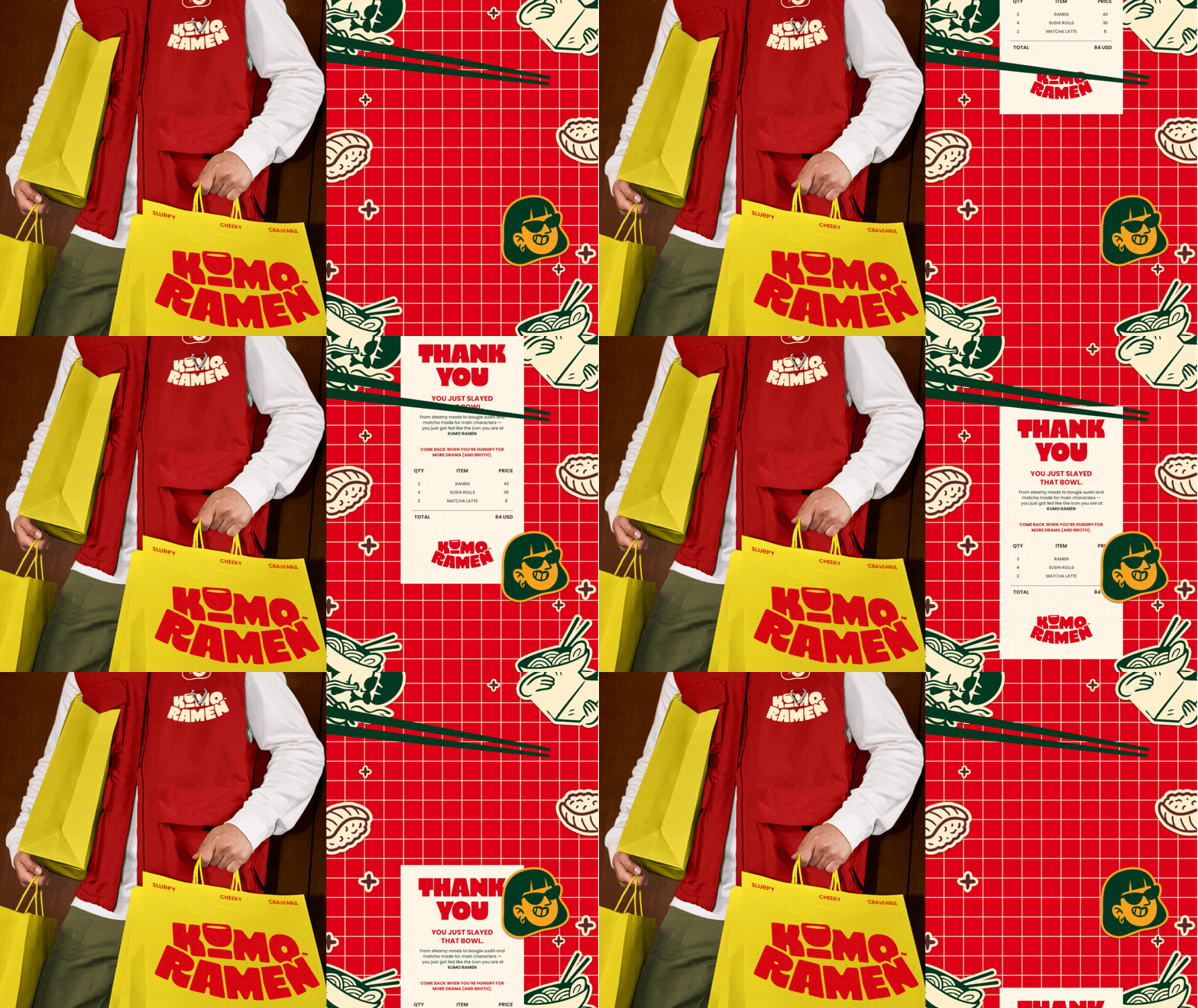
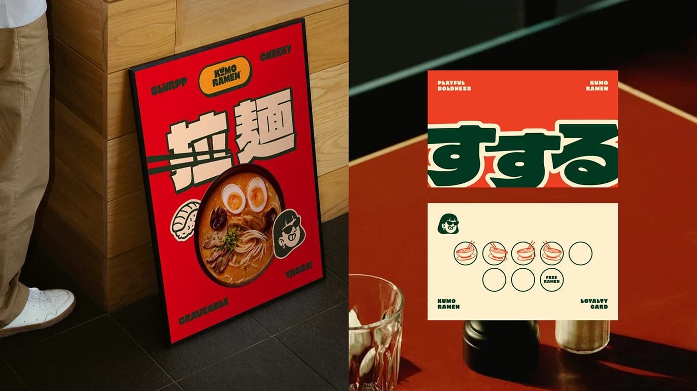
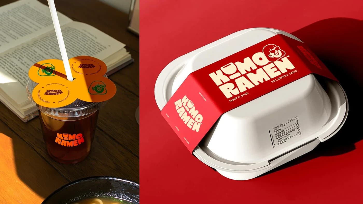
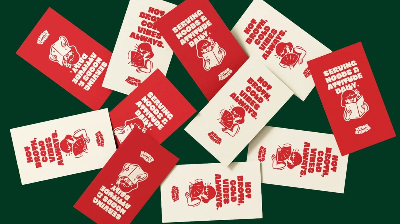
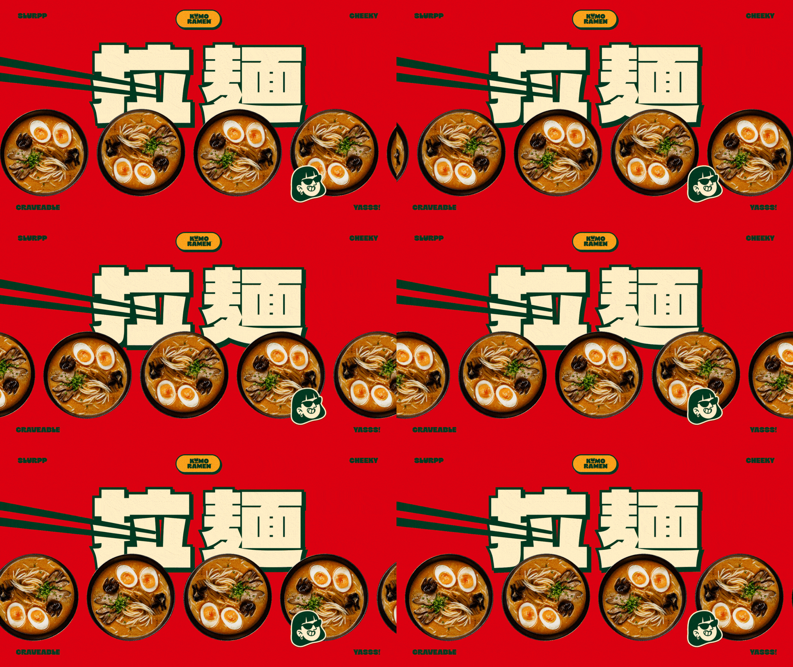
The creative process centered on developing a visual system that could stand out against the busy environment of a ramen shop. By using a bold, limited color scheme and thoughtful layout design, I ensured the brand could be clearly recognized from a distance, whether on packaging, signage, or social media. This project displays my ability to craft distinct, high-impact branding that thrives in competitive, high-energy environments.
By distilling the essence of the brand into a few essential visual elements, I was able to create a flexible identity that supports both the physical shop and its digital presence. The result is a cohesive brand experience that invites customers in while staying true to the craft of the food itself. Kumo Ramen is a prime example of my design philosophy: keeping the core of the brand simple, strong, and highly intentional.